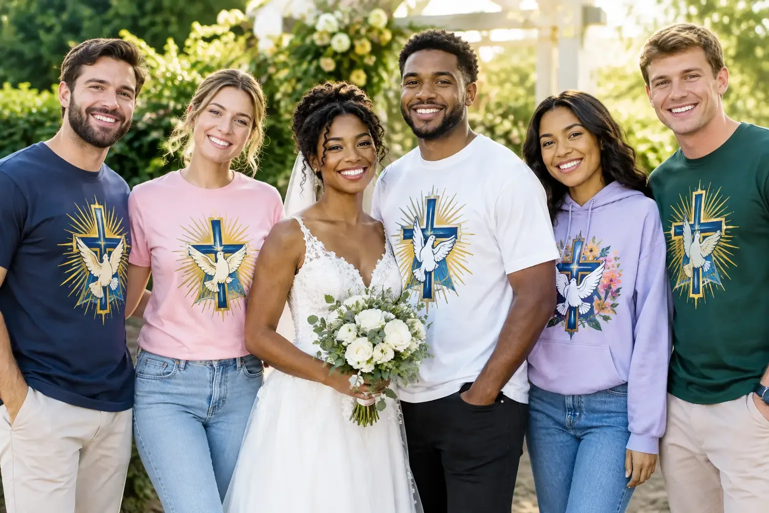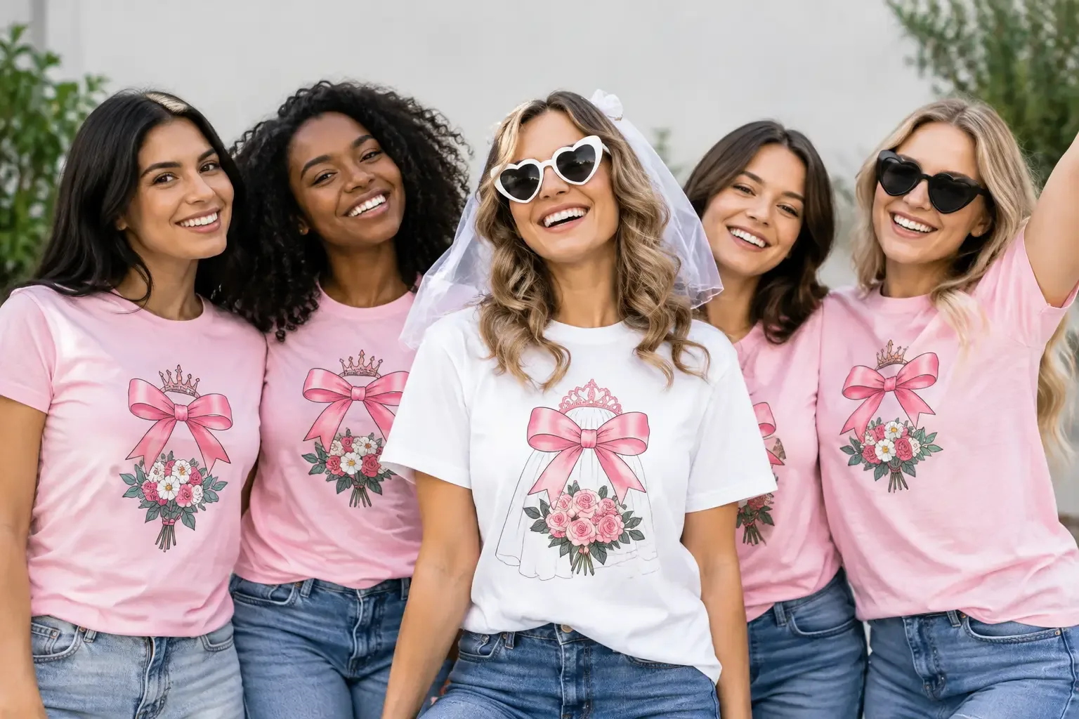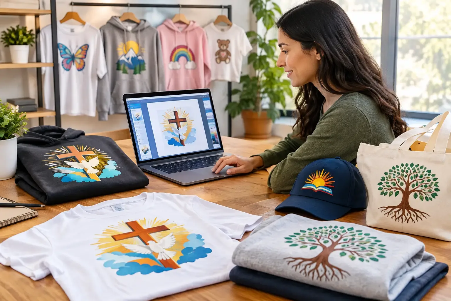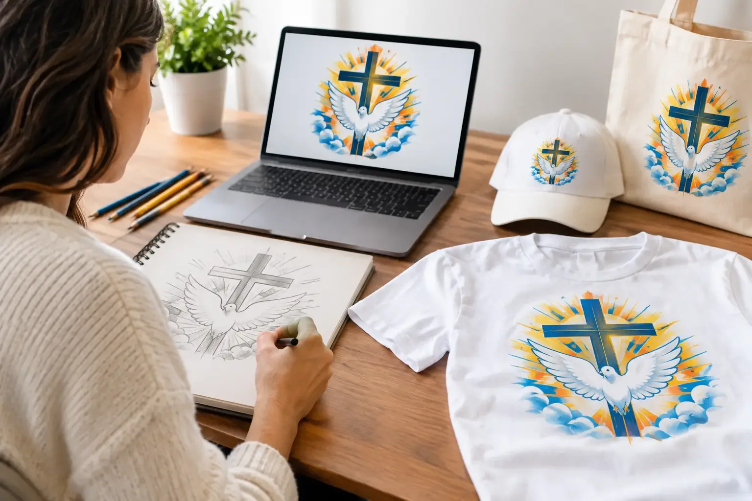
That doodle on the corner of a notebook might be the whole point of the shirt. Maybe it is your kid’s drawing of the family dog, a rough camp logo, a hand-lettered birthday phrase, or the tiny symbol your friend group puts on every trip photo. You do not need polished art to turn a sketch into a shirt design. You need a clear idea, a usable photo or scan, and a few smart choices about color, size, and placement.
The goal is not to make your sketch look like a corporate logo unless that is what you want. Keep the charm that made you save it in the first place. A wobbly line, uneven lettering, or slightly strange character can feel more personal on a tee than something overly cleaned up.
Start with the sketch, not the software
A sketch can begin on paper, a tablet, a napkin, or a classroom worksheet. Paper is completely fine. What matters is whether the main lines and words can be seen clearly enough to reproduce.
Before you photograph or scan it, look for the parts that must stay. That may be the exact handwriting, a particular facial expression, or the crooked shape of a heart. Then identify what can change without losing the idea. A designer may smooth a shaky edge, thicken a line that would disappear in print, or adjust spacing so the words are readable from a few feet away.
If there is a phrase in the sketch, double-check spelling now. It is easy to focus on the drawing and miss a missing letter in “Reunion Crew” or the date of a graduation party. If the wording has a joke, nickname, or meaningful typo that is intentional, make that clear when you submit the artwork.
Capture a clean version of your artwork
A scan is ideal, but a well-lit phone photo often works nicely for a simple drawing. Lay the paper flat on a plain surface, use bright indirect light, and hold the camera directly above it. Shadows from your phone, fingers, or overhead lights can make cleanup harder.
Avoid filters and heavy editing. They can erase light pencil lines or change colors you want to keep. If your sketch uses a pale marker, colored pencil, or watercolor wash, take a couple of photos in different lighting and choose the clearest one.
For a black-ink drawing, increase contrast only enough to separate the lines from the paper. Do not sharpen it until every pen mark looks jagged. The best file preserves the personality of the original while giving the printer a clean visual to work from.
A few details make the handoff smoother:
- Photograph the entire page, including the edges, so nothing is accidentally cropped.
- Send the largest, original image file you have instead of a screenshot from a text thread.
- Note any colors that must match the original, especially for school, business, or event artwork.
- Include a second close-up if the sketch has tiny writing or fine details.
Decide what the finished shirt needs to do
A shirt for a one-night bachelorette party has different needs than uniforms a small business will wear every week. The sketch is the starting point, but the occasion helps shape the final design.
For a gift or family shirt, a hand-drawn look can take center stage. Put a child’s drawing large on the back, for example, then add a small name or date on the front. For a company team, you may want to retain the sketch’s concept while making the lettering more consistent and readable. For a church retreat, club, or school group, a simple front graphic is often easier for a range of ages and shirt sizes.
Think about where people will see it. A chest print reads quickly in a photo. A large back print gives a detailed illustration room to breathe. A sleeve or left-chest mark works well as a quieter detail, but it is not the place for a full scene or a long quote.
Also consider the garment color early. Black line art on a light shirt can look crisp and playful. On a dark shirt, that same drawing may need light ink, a colored outline, or a filled background shape. A live preview is useful here because a design that looks great on a white digital canvas may need a different treatment on navy, black, or Sport Grey.
Keep the design printable, not overworked
Hand-drawn artwork often includes fine lines, soft shading, and tiny details. Some of those elements can print well; some become hard to see once they are on fabric. The fix is not always to make everything thicker. It depends on the style and the intended print size.
If your sketch includes delicate pencil texture, you can preserve that feel by simplifying the weakest marks and keeping stronger strokes where the eye needs to focus. If it has a tiny illustration inside a larger badge, enlarging the badge may work better than trying to force every micro-detail into a small left-chest print.
Color is another trade-off. A limited palette can make a sketch feel bold and cohesive, especially for group shirts. More colors can preserve a child’s rainbow drawing or a detailed illustration, but they should have a purpose. Ask yourself whether each color adds meaning or just adds visual noise.
Text deserves extra care. Script and hand lettering are personal, but readability comes first. If the words are part of someone’s original handwriting, a designer can often retain the feel while improving spacing, contrast, or size. If the text is simply a placeholder, choose a type style that supports the drawing rather than competing with it.
Get help when the sketch needs finishing
You do not have to become a vector-art expert to make a shirt you are proud to give out. If you have the sketch and a clear direction, that is enough to begin. Tell the design team what should remain untouched, what you want added, and where you picture the graphic on the garment.
A helpful request sounds specific without being technical: “Keep my daughter’s dragon exactly as drawn, clean up the pencil smudges, add ‘Campfire Club 2026’ below it, and make it work on a dark hoodie.” You can also mention the mood you want: funny, vintage, bold, sweet, minimal, or messy-on-purpose.
Coolprez can turn an idea or uploaded artwork into finished artwork, with a first draft typically ready within 2 business days. If you choose the free artwork check when uploading, a person looks at the file before it prints, which is especially reassuring when your design came from a quick sketch instead of a finished digital file. Review the proof carefully before approving it. Check names, dates, punctuation, colors, and whether the sketch still feels like yours.
Only submit artwork you created or have permission to use. That protects your group and keeps the project focused on the people and moments the shirt is meant to celebrate.
Plan for one shirt or a whole group
A hand-drawn shirt does not need a giant order to be worth making. One tee can be a meaningful birthday gift, a new-dad surprise, or a keepsake from a child’s first drawing. The same artwork can also become the thread that ties together a reunion, volunteer day, team event, or family vacation.
For groups, keep the main design consistent and give people practical choices around it. Adults may want tees, hoodies, or crew sweatshirts. Kids may need their own sizes. A shared group-order link lets each person choose a size and pay for their own item, so the organizer is not stuck collecting money and chasing down size charts in a group chat.
Do one final check of placement and garment color before the group orders. A centered design can sit differently across youth and adult sizes, and a light graphic may need contrast on darker garments. The goal is not perfect sameness at every size. It is a design that still looks intentional and readable on the people wearing it.
Your sketch does not have to be flawless to deserve a place on a shirt. Sometimes the uneven line is the memory. Give it a clean photo, a clear purpose, and enough room to be seen, then let people wear the idea, the moment, and the inside joke.